Showing posts with label Digital. Show all posts

Friday, 8 April 2011

Media Product - Vanilla Twilight - Image Reel

"When Violet Eyes Get Brighter,
And Heavy Wings Grow Lighter,
I'll taste the sky and feel alive again."


Image and Lyric Breakdown:
  • When - Clock / Time representation
  • Violet - The plant, Violet
  • Eyes - My dog, Bailey's eye
  • Get - Online Adobe download message
  • Brighter - Two versions of the same lightbulb in my room, with altered brightness of lens flare
  • And - '&' key from my iPod Touch (took a photograph)
  • Heavy - 'Heavy Load' sign
  • Wings - Bird in Flight
  • Grow - Plant Growing
  • Lighter - Feather - as in 'light as a feather'
  • I'll - Photo of me
  • Taste - Two angles of a mouth tasting a lollipop
  • The - 'Highlighted the T, H and E keys on a standard laptop keyboard in red
  • Sky - Sky shot and edge of Victoria Mills, Saltaire
  • And - '&' key from my iPod Touch (took a photograph)
  • Feel - Hand feeling fabric
  • Alive - Heart-monitor to represent life
  • Again - Cover of the DVD '17 Again'


Below is the background image, so you can see what it would look like without the image reel over the top - although, again, I have kept it in the same comic-book style as the rest of the images. It is supposed to represent the song - by depicting a 'Vanilla Twilight'.

Vanilla Twilight - 'Oh, Darling, I wish you were here'.

Tuesday, 5 April 2011

Night-time Photoshoot - Victoria Mills

The main (new) building and Walkway

The old building (over the Tennis Court)

The Fountain and Runway (Lighter Filter)

The Fountain and Runway (Darker Filter)

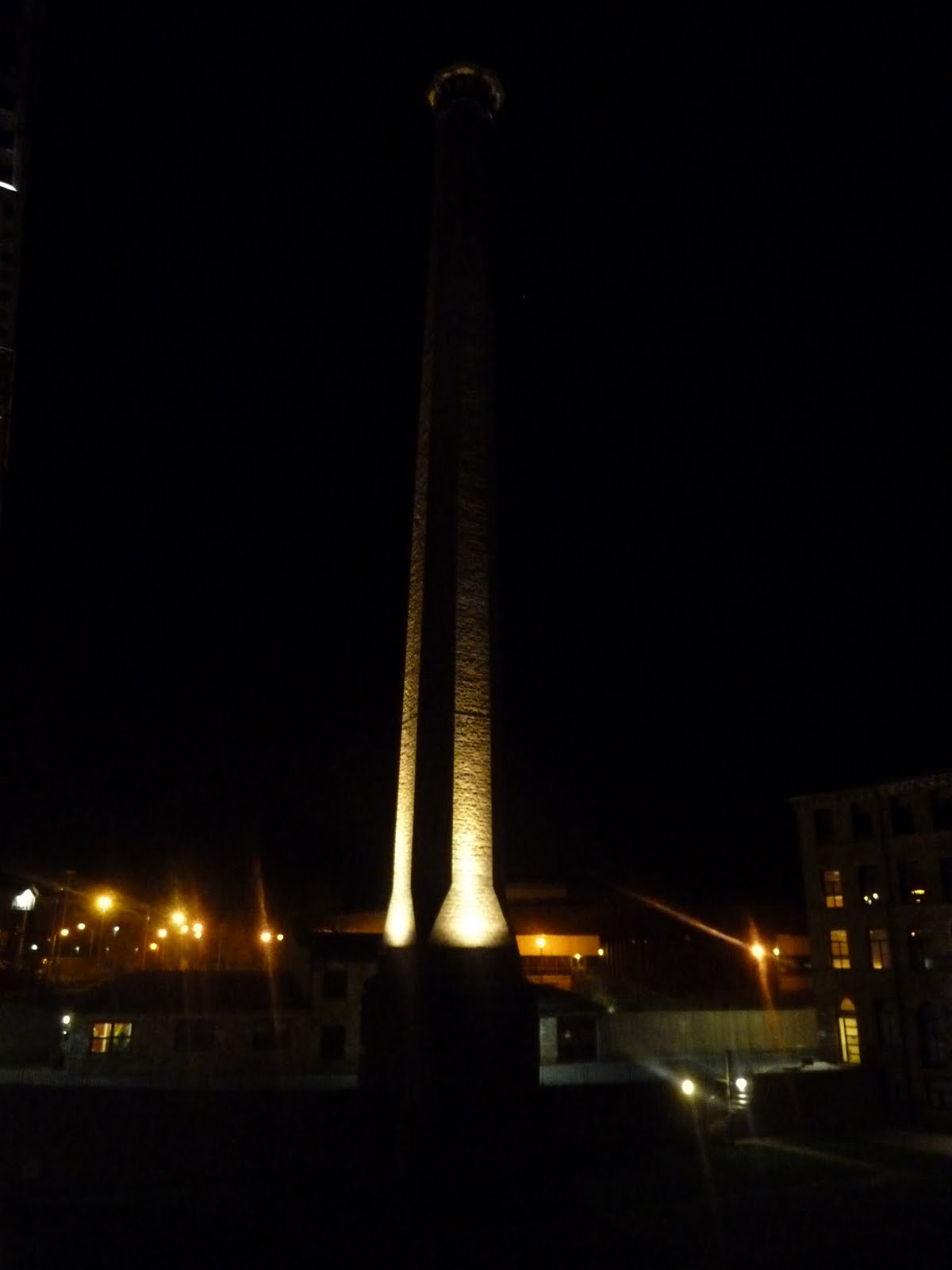
The Chimney

Yesterday, I was staying over at Victoria Mills, and was captivated by the sights of the chimney and the walkways all illuminated. I took a number of photographs, with the intention of manipulating the strangest one to suit the style of my Comic-book storyboard idea (see below).

The images above are all quite dark, but this was deliberate. I had a go at using different filters on the Camera to get different effects, but found that to tie in with previous entries about darkness, shadow and contrast, leaving the settings to compliment the hour of day worked really well.

The images require careful study to make clear sense of what they depict, due to the intense use of shadow. But by adding in captions beneath each image (Anchorage and Relay, Barthes), I can explain a little easier the key features shown.


The Chimney Base (Original)


The Chimney Base (My Manipulated Comic-Style)

Tuesday, 29 March 2011

Photograph Analysis

Purpose
The purpose of the image was.... well, honestly?? Not a clue. I saw an opportunity and I took it. Inspiration for another blog post was scarce, but here I was, sat in front of a Mac at the University and suddenly I noticed just how obvious my reflection was in the monitor.

Production
The only piece of equipment available to me at this particular moment in time was my Samsung smartphone. This will, therefore, serve to provide demonstration to the belief that you don't need state-of-the-art photography equipment to create an attractive image. Though I suppose having a state-of-the-art Mac suite would be immensely beneficial in this instance.

Framing
The image is as close to centrally aligned as I could manage, bearing in mind certain factors; the desktop of the Mac I was using had a number of icons available along the right side and along the bottom. These reduced the space I could use if I wanted to ensure no icons made it onto the image.

Lighting
There are three sources of light within this image:
  • The Window - Natural Light Source
  • The Phone's Flash - Artificial Light Source
  • The Mac Screen - Artificial Light Source
In short, the image contains a combination of both natural and artificial light sources.

Much to my disbelief, the only source of light I would say is most affecting the image directly is the natural light coming in through the window behind me. It helps to provide contrast to the rest of the image, making my figure stand out against the background. The Mac screen provides a much subtler source of light - most predominantly on the right-hand side of the image, whilst the flash of the phone served to create a (deliberate) lens flare. In reality, I was slightly out with regards to framing: I had hoped that the lens flare would have completely covered the mouth area. However, I am still happy with the location - rather than leaving out a body-part, there is the subtlest hint that it exists, and so viewers are aware that behind the camera is the mouth that would normally be there. It almost feels like a sneak-peak.

Signifiers & Signifieds
  • The figure (aka ME!)
  • The phone
  • The glasses
  • The stars
The figure is the main part of the image (and this isn't me being egotistic, so just work with me). In terms of photography, it should represent a memory that is to be saved, else there is no point of taking the photograph. In this case, because I'm the one who took the image, I will always associate the image with writing this blog entry. It was created specifically for a piece of work, and thus has little to no other significance in my life (although I really like the image, so might choose to make it my Facebook picture). But to someone who doesn't know me, it could signify something completely different.

From a subjective point of view, if I was looking at this as an outsider, I would see the figure and think; 'Student'. Mainly because of age. Also, the fact that the figure appears to be sitting at a desk (though this is not made obvious - you can partially see the chair but not the actual desk) helps to narrow down options to one of two - either a student, or somebody who has a desk-job. Thus, age and location make me think of a student.

Typically, glasses are associated with intelligence. I have no idea why this is, it could be a stereotype that just happens to have lasted world-wide. Nerds and geeks are often seen wearing them, and these types of people are stereotypically fairly smart in certain areas. It is widely assumed that those who wear glasses are generally 'smarter', or at least are trying to make themselves look more intelligent by wearing them. In my case, I wear glasses because I have to, not because I want to. Without them, I'm blind. But as an outsider thinking stereotypically, I would see the glasses and think the person in the image was intelligent; now, of course, I know myself and how untrue that statement is. So here is an example of 'inaccurate' stereotyping in action.

The stars are symbolic of space and the worlds beyond the one we know. I can see stars in the image, and I think of how life at University can be like living on a whole new planet. It really is an out-of-this-world experience; something that will only ever happen once and should be treasured: the tiny smile on my face and my neutral expression should represent my contentment, as well - another signifier!

The phone signifies communication. Or lack, thereof. On a way deeper level, it can represent the module I am working on - how images can communicate with viewers without words. But at the time, I was happy to settle for the idea of mobile communication overwriting physical human-interaction (which is why I deliberately tried to place the phone over the mouth area). After all, who needs a voice when you can email, text, Facebook and Tweet from your phone?

Funny. All those little representations. I'd never have thought so deeply into the image, were I not required to do so for my coursework. But it is interesting what you can come up with, even with the vaguest of images...

Wednesday, 16 March 2011

Graphics Tablet Suzuki Bike - Flash Drawing

So. I started with this....

A photo of the 'Rio Grande' road in Western Texas (apparently one of the most scenic roads in the world!).

With a little photomanip and a whole lotta love, I ended up with a scene that would better suit the 'Flash drawing' design of my own artwork (you will see later!) to use as a backdrop. Gladly, I would have taken this photo in person to use for this particular piece of artwork, but alas, flying to Texas just to take a photograph would have been a bit too great a stretch for a student budget.

Next, now that I had a lovely comic-style background (and I've just realised a lovely 3 on 3 pattern happening with regards to the 'Rule of Thirds' but more on that in a second), I used a Graphics Tablet to draw a Suzuki Bike in Adobe Flash CS3 (see below).


Aannnnddd, finally! The moment of truth...


Combine Flash-drawn bike with Comical background....


And happy days.

The bike actually
fits in with the image. See, as I was drawing it freestyle in Adobe Flash, the background was plain and boring and grey. Which was great while I was drawing, but as a finished image, it lacked a little... shall we say, pizazz? When I combined the flash-style super-bike with the original Rio Grande photograph, it looked dramatically out of place. As an image, if I were going for making a statement, it could have worked, I suppose. 'Expressive meets Tradition', and all that. But at the end of the day, due to my fascination with comic-books and the wonderfully simple and bold style of drawing in Flash, it just made sense to combine the two elements together for the finished piece.

Rule of Thirds - twice! One second...

Okay, so it's not
exactly perfect, but considering it's a manipulated photograph, it's pretty damn close. Almost as though Mother Nature herself understood the concept of the Rule of Thirds when creating the landscape (or insert religious idol of choice, if it isn't Mother Nature according to your beliefs).

Upper section = sky.
Middle section = mountain range.
Lower sections = road, bike, ground.

Each section draws the viewer's attention to a certain aspect of the image. It's quite amazing that the correct positioning of a camera can create an image with clear proportion, enough to purposefully segregate elements of that image according to this rule.

(As a footnote, yes, I
am British. And my superbike wants to drive through Western Texas into oncoming traffic for the laughs, just because we do that at home. Seriously, are we the only people to have 'left-hand-traffic' laws? Call the bike's positioning a culturally-inclined alteration to the norm of drive-time in southern America. Just because I'm British.)

Thursday, 14 January 2010

As part of my course, I have been asked to make an Interactive CD-ROM. I have decided to do one based on the hit TV-Show: 'Doctor Who'. This is because I have easy access to a lot of its assets - in the form of images, episodes, audio files, etc - and also, most importantly, because I totally love the series. I intend to focus more on the regenerated style that will suit the new series airing in March, so this project will be a bit like a promotional CD-ROM for the show.

I have combined my skills with Premiere Elements, PhotoShop and Flash to create this welcome screen :-


It includes a High-Definition version of the 2010 series trailer, starring Matt Smith. I have used PhotoShop to create the background, edit the logo, create the 'CD-ROM' banner and add in a video border. I then used Premiere Elements to alter the video to get it the best possible quality. In the end, it had to be exported as an .flv file (flash video file) which only plays through the Flash programme. However, I'm hopeful that this will not stop the video playing when it is finally transferred onto a CD-ROM.

Finally, after exporting all layers from the Photoshop file into PNG-24 files (with transparency), I then created a new Flash file and imported everything over, arranging it as I want it and adding in the trailer.

I'm really happy with how this has turned out. I will use the same sort of style for every other page to make keep with continuity throughout.

Friday, 19 June 2009

Unit 53 - Storyboard Project

This project involved researching and finally creating a storyboard, with an included character from a team-building exercise we took part in at the start of the year (this project being a 'Name the 100 Cartoons' quiz). The character I chose to work with was 'Kimba the White Lion', a cartoon character from an old anime. I had intended originally to work with a more 'scratchy' style of artwork - as I attempted to do on the image I made displayed above. This would have made for a more unique and original storyboard. However, time constraints meant I had to work as quickly as I could without worrying about altering the style of my artwork - it was more a case of simply getting it finished, rather than getting the style right. If I were to have more time to work on my storyboard, then I could have altered the style to fit with the 'scratchy' style I wanted, but as it is, time has run out. :/ Therefore, the end product doesn't completely match my original intentions - by the fact it isn't the style I was hoping for. But aside from the actual artistic style, everything else has worked out how I had hoped it would.


On the left is my finished hand-drawn version of the storyboard I ended with, which I have scanned in ready to recreate the digital version. It is a simple story; at an electronics store (near you) the show, 'Kimba the White Lion' is being shown on a flat-screen television. Kimba sees the TV, however. And jumps out. There's a girl in the store who is scared by this, but then Kimba gets scared at seeing the girl who is - once the shock wears off - incredibly excited. She chases Kimba through the store, but he escapes outside and runs off down the street. It has no violence or foul language, therefore it is suitable for a younger audience to view, and as Comic Strips are mostly targeted at young audiences, I have successfully created a storyboard to fit with my target audience.


On the right is my final digitally amended version of the storyboard. I have created this using PhotoShop CS3, after scanning in the original version to use as reference to redraw each box on a separate layer. I have added in text and a title - 'Kimba Encounters the Humans' and created a textured background to help bring the whole piece together using pre-installed brushes. I used a collection of 'Fractal' brushes for the background, and have used other techniques such as including gradients, paint and using the pen tool to get strong black outlines. My boxes are abstract and unusual, rather than simple square boxes. This is because I have tried to incorporate some of the different layout styles I researched to make my storyboard look more interesting. I had originally planned to use different fonts, as well. I researched into different styles but found when it came to putting them on my final storyboard, they weren't very easy to read. Therefore, I have stuck to a Comic-strip Classic - Comic Sans and am pleased with how it looks on my finished Storyboard.

I have successfully managed to meet the deadline of this project, although it has resulted in me altering the style of my storyboard from the one I wanted to a more simple, cartoonish style. This is the only problem I have encountered with regards to timing. I have learnt a variety of new skills on PhotoShop - prior to this, I had never been able to successfully use the Pen tool to create strong lines, and had simply struggled with the brush tool to make them as thick and straight as possible. This new skill will definitely be useful to me in the future.

Overall, I am very happy with my finished Storyboard, albeit without the artistic style I had intended. The only thing I would change is the style, and if I were to progress further and create the actual Comic Strip, it would have been good to make it Interactive, as well.