Friday 8 April 2011

Media Product - Vanilla Twilight - Image Reel

"When Violet Eyes Get Brighter,
And Heavy Wings Grow Lighter,
I'll taste the sky and feel alive again."


Image and Lyric Breakdown:
  • When - Clock / Time representation
  • Violet - The plant, Violet
  • Eyes - My dog, Bailey's eye
  • Get - Online Adobe download message
  • Brighter - Two versions of the same lightbulb in my room, with altered brightness of lens flare
  • And - '&' key from my iPod Touch (took a photograph)
  • Heavy - 'Heavy Load' sign
  • Wings - Bird in Flight
  • Grow - Plant Growing
  • Lighter - Feather - as in 'light as a feather'
  • I'll - Photo of me
  • Taste - Two angles of a mouth tasting a lollipop
  • The - 'Highlighted the T, H and E keys on a standard laptop keyboard in red
  • Sky - Sky shot and edge of Victoria Mills, Saltaire
  • And - '&' key from my iPod Touch (took a photograph)
  • Feel - Hand feeling fabric
  • Alive - Heart-monitor to represent life
  • Again - Cover of the DVD '17 Again'


Below is the background image, so you can see what it would look like without the image reel over the top - although, again, I have kept it in the same comic-book style as the rest of the images. It is supposed to represent the song - by depicting a 'Vanilla Twilight'.

Vanilla Twilight - 'Oh, Darling, I wish you were here'.

Wednesday 6 April 2011

Images Within An Image

Copyright © 2011 Stefan Van den Bergh

Not exactly related to my media product, but I saw this image and absolutely fell in love with it.

The thought of creating multiple images all hidden within one larger, core image is remarkable. Taking this one as my example, it is a beautiful landscape setting showing mountains, rivers, waterfalls, fields and sky as the core image. But hidden in and amongst the scene are a number of animal faces representing another feature of that core image.

The human face is a predominant land feature in the foreground - you can recognise it from the eye, nose and mouth features proportionately arranged along its length. Cliff-faces are made up of monkey / baboon / gorilla heads - again, made clear by the distinct eyes / nose / mouth features of those animals carved into the mountain walls.

I also see an area of land at the bottom shaped like a bird's head, a rock in the water shaped like a frog, and even clouds in the sky shaped like fish and - I think - a wolf. There even seems to be a section of forest / greenland shaped like a teddy-bear, as well as crocodile features and even something carved into a rock that looks like a dragon's head...

I was toying with the idea of making another version and highlighting all the sections of animals I could make out. But when I started, I realised every section represents an animal, and so it would have resulted in the whole image being highlighted making it less obvious to see the details of each animal. Therefore, I shall leave you to explore it at your own leisure, and consider the characters you can make out. You can see a slightly larger version here.

For me, this is visual communication at it's best. The image is communicating so much about our planet through a very unusual medium; by integrating the animal kingdom into the geographical features of the landscape.

Tuesday 5 April 2011

The Lyrics for my Media Product

I have chosen the song 'Vanilla Twilight' by Owl City to base my final media product on.

There is only one key verse that I want to use, however. I will make a storyboard / image reel of literal photographs (in comic style) to accompany the lyrics below:

"When violet eyes get brighter,
And heavy wings grow lighter,
I'll taste the sky and feel alive again."

Night-time Photoshoot - Victoria Mills

The main (new) building and Walkway

The old building (over the Tennis Court)

The Fountain and Runway (Lighter Filter)

The Fountain and Runway (Darker Filter)

The Chimney

Yesterday, I was staying over at Victoria Mills, and was captivated by the sights of the chimney and the walkways all illuminated. I took a number of photographs, with the intention of manipulating the strangest one to suit the style of my Comic-book storyboard idea (see below).

The images above are all quite dark, but this was deliberate. I had a go at using different filters on the Camera to get different effects, but found that to tie in with previous entries about darkness, shadow and contrast, leaving the settings to compliment the hour of day worked really well.

The images require careful study to make clear sense of what they depict, due to the intense use of shadow. But by adding in captions beneath each image (Anchorage and Relay, Barthes), I can explain a little easier the key features shown.


The Chimney Base (Original)


The Chimney Base (My Manipulated Comic-Style)

Sunday 3 April 2011

Stereotyping Through Use of Colour

I am going to show you two versions of the same image (both versions I have personally altered to suit this blog post), and then ask you who would generally prefer which version.


But before I do, I will just mention:

John Berger's Ways of Seeing, has inspired this a little. His theories on manipulating an image to create different meanings left me pondering on Stereotypes, and how different versions of images appeal to different target audiences because of preset customs and beliefs. So, I guess, this blog entry is another that should be linked to his theories.


So. Ready?


Take a look:


I'm sure you can guess what I'm thinking about, here.

In terms of Gender, who would prefer which colour??


If you thought 'pink = female' and 'blue = male', you are stereotyping straight away.

Thanks to modern culture and society, it has become an unwritten rule, almost, that anything 'pink' has to be targeting females. And for a man to drive around in the pink version of the Audi R8 Spyder above would be 'embarassing'.

In reality, there is no reason at all why a guy couldn't drive this car. If, for example, they actually liked the colour, they would be more than welcome to purchase this version. However, I can guarantee people would stop and stare, and because of the way people stereotype, a lot would even talk behind that person's back, whispering false accusations and assumptions about their character and sexuality.

It is wrong, and it is unfair.

It is stereotyping.

For the majority of males, regardless of whether or not they like the pink coloured version, they would refuse to buy it, refuse to even consider test-driving it purely out of ... for lack of a better term - fear of damage to their street-credability. Despite the fact owning a car like this would cost near £150'000 and would suggest they are immensely successful and impressive, the colour would leave people wondering, and this could be damaging to that person's reputation.

Similarly, for a girl to drive the dark-blue version would leave passers-by considering their sexuality, too. Consider them to be tom-boys or the likes. Personally, I love that colour and would take the blue version over the pink one, any day. So here is me, ripping the theory of stereotyping clean away; I am a girl, and would not prefer the pink version.

But if it came down to it, and they had a lot of both money and reputation at stake, I reckon a lot of car-buyers would think very carefully about the colour of the car they choose before driving out of the saleroom.

Ways of Seeing - Manipulation of Meaning Through Reproduction

Reference to:

Berger, J. (1972) Ways of Seeing. London. British Broadcasting Corporation and Penguin Books.

"... as soon as the meaning of a painting becomes transmittable, this meaning is liable to become manipulated and transformed. It is no longer a constant; It's changed by the camera that moves, by the words put around it, by the music played over it." - John Berger, Episode One, Ways of Seeing.


I'm playing here, so bear with me. This is a section of an image. Little to see, really - it's a covered roadway and walkway; looks to be evening time, if we consider the lighting, and the fact the buildings in the background have lights on.


Then the screen pans across slightly to reveal a little more....

By highlighting the section in red, the eye is automatically drawn to the section of interest. I am also trying to - both physically and metaphorically - highlight the fact that there is an image inside another image. The use of colour is the same - it is the same time of day as the rest of the image, same location, same everything. But by adding in that little bit more, the meaning of the image changes, and the main focus of the image is altered.

The image has gone form being a boring scene of a road, a barrier, a few distant buildings and a pathway, to show something far more interesting; ghostly figures walking toward the camera.


As Berger suggested, by manipulating a reproduction of the original image, I have adjusted the meaning of the image to show one thing, and then altered it again to reveal something else; the first image shows only a small section of the true image, despite being the larger section. By taking away the ghostly figures, the meaning was changed. But cleverly, by putting it back together, the eye is now automatically drawn to the most interesting section in the full image above: now that I have isolated the ghostly figures by highlighting the area in red first, I am instantly drawn to that same area on the original version because I know that the figures are there.

This can be altered even further. I am thinking thrillers and horror movies, where the camera pans painstakingly slowly across the scene - in this case, from left to right to build suspense, as the ghostly figures are on the right. Adding in a low, chilling score to heighten the anxiety and tension would improve it, as well.

Of course, you could then completely spoof the supposed 'spooky' feel of the image by adding in a hilarious score and zooming the camera all over the place. The meaning would be altered, and the genre of the image would change from horror to comedy. Thus, Berger is quite right in suggesting reproduction of imagery is leaving room for manipulation and alteration of the originally intended meanings.

Saturday 2 April 2011

Advertising Tricks and Techniques

I've been looking into how visual communication works in advertising a little more since last analysing the Cadbury's advert. It is an area of the media that is of significant interest to me. I'm baffled by how easy it is to sell an item to the public so simply. They need not even leave the comfort of their own homes - it is all done over the radiowaves or through television boxes.

The fact that people are so susceptable to influence is astonishing. Though, of course, when producing adverts, the creators have a few tricks and techniques which will serve ultimately to improve chances of selling their product; even if these tools mean altering how the audience will receive the advert.

These include :-


Hidden Messages – where producers include a hidden message inside the advertisement, making the advert a little less obvious than most, meaning viewers have to actually think about the ad to fully understand the message. This helps viewers to remember the ad at a later date, giving the potential for the company (and the advert) to spread via word of mouth, as people will talk about how unusual the ad is with regards to getting the message across.


Emotional Response – where producers work with the audience’s emotions to produce a reaction. This can either be through shock, humour, surprise, horror, or another form of emotion. Producers use this to work on the ‘Want / Need’ factors which plague the average human being. Viewers see the ads and immediately feel like they ‘need’ to go out an buy the products. This happens a lot with beauty products, where producers depict the main actresses or actors as being beautiful because of the product, even though it is simply because the producers have picked generally attractive actors / actresses to advertise them. This is self-perception, but ads also use the emotional response technique to advertise health services and life insurance by playing on audience fears of death and illness.

Celebrity Endorsement – where producers have celebrities who appeal to the specific target audience to promote the product. This is clever, because the audience would like to be like the celebrities in the advert, and would therefore be more inclined to buy a product if they believe it appeals to their favourite celebrity. Having a Celebrity as the face of a product also gives that product its own personality (matching the one of the celebrity).


Cultural Iconography

Cultural Iconography refers to creating a character that suits a specific culture and placing them as main characters in an advertisement. These characters become recognisable (icons of adverts). The more adverts they star in, the more they become associated with the product which they are advertising.

As an example, the ‘Honey Monster’ is the iconic character for ‘Sugar Puffs’, and has been present in most (if not all) adverts surrounding this product. Therefore, if anyone were to see the character’s face, they would immediately be able to recognise where the character is from and will associate him with ‘Sugar Puffs’.

Similarly, Tony the Tiger is an iconic figure recognised for his inclusion in the ‘Frosties’ cereal advertising campaign. Nowadays, most children in Britain could probably identify a picture of him if they saw one, and would be able to associate his character with the cereal he advertises. When using icons to promote a brand, producers also like to have a memorable slogan which that character says at some point during the advert. Sticking with ‘Frosties’, Tony the Tiger’s slogan for the cereal is; ‘They’re Grrreat!’. Therefore, if anyone were to hear this, they could most likely trace it back to the advert for ‘Frosties’, because this is where it originated from.

However, it cannot be forgotten that these are culturally affected. A person in Britain could easily identify these characters because they are British characters for British products. Should an image of Tony be shown to an Egyptian or an American, for example, they would not be able to recognise the character as an iconic figure, because their culture doesn’t have access to the product he is advertising. Therefore, he would not affect them the same way he affects British people.

Many times, the characters in adverts are actually stereotyped. This is probably because producers only have a matter of 15-30 seconds to get their message across, and using stereotyped characters would make it easier for viewers to understand the meaning of the ad within the time limit it has to broadcast.


Structure and Form

When it comes to designing an Advert that is to be displayed on Television, there are a number of different structures and forms that the producer can use to get the advert across to its target audience. These include :-

Narrative – where a producer has created an advert with the intent of it telling a story whilst advertising.

Series – where a producer has created a series of adverts for the same company with the intent of creating an ongoing saga – examples of this would be the BT Adverts, the Nescafe Coffee adverts and the Daz ‘soap’ series.

Stand Alone – where a producer has created an advert not with the intent of creating a series, but which tells its own story within the ad itself – almost like a mini-film. An example of this would be the Guinness Advert.

Animation – where a producer has created an animated advert, rather than using filmed footage. As an example, the new N-Power advert includes a mini clip created by ‘Wallace and Gromit’ creator, Nick Park.

Friday 1 April 2011

Benjamin - The Work of Art in the Age of Mechanical Reproduction

Reference to:

Benjamin, W. (1936) The Work of Art in the Age of Mechanical Reproduction: Zeitschrift für Sozialforschung.

After reading the essay (translated into English, of course) as part of the core reading for this module, there was one paragraph that really stood out for me.

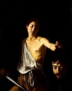
"Even the most perfect reproduction of a work of art is lacking in one element: its presence in time and space, its unique existence at the place where it happens to be. This unique existence of the work of art determined the history to which it was subject throughout the time of its existence. This includes the changes which it may have suffered in physical condition over the years as well as the various changes in its ownership."

It is really quite remarkable, just how much a piece of artwork is worth in its original form.

Because of the ease in modern society with which works of art can be replicated and reproduced, the value of the original piece is significantly boosted. Mostly thanks to educational trips throughout my time at school and college, I have been to many different Art Galleries and seen original pieces strung up in all their glory, taking pride of place on the walls of ancient buildings. Free for everyone to admire from afar - staring in through glass cases or leaning over rope-barriers.

And these pieces of art are so heavily guarded - night and day. The older the piece, the greater the security. An awful lot of money goes towards installing state-of-the-art security equipment and there are nightwatchmen to guard the building out-of-hours. All due to the fact the pieces inside the building are originals. They are the truest, realest versions. Real paint, real canvas, real pencil, real crayon, real clay or stone or metal or ice or whatever is used to sculpt, these days.

It is fair enough to say that, outside those buildings, there will be an unlimited number of copies. All illegimate, all fake, but all looking damn-near exactly the same - and people wouldn't pay even a tenth of the price for those as the originals cost. So, for all intents and purposes, you can get a piece of priceless artwork for tuppence and hang it on your wall at home to admire it - rather than trekking nationwide to glance for a minute at the original through a glass box before being hurried along by rushing tour-guides.

The problem is, the copy might look exactly the same - right down to the tiniest of brush-strokes - but it isn't the original. The value instantly vanishes; the exact same piece of work is suddenly effectively worthless, not priceless.

So here, you weigh up worth in terms of physical monetry value against the knowledge of owning a duplicate version that is easily accessible. Would you rather have that version there, despite its lack of payout upon resale, or are you willing to pay bus / train / taxi / plane-fair to get to the only Gallery that houses your particular artwork piece ??

Walter Benjamin is right - there is nothing quite like the original. There never will be. But unfortunately, accessing the original format of anything nowadays is virtually impossible. The age of mechanical reproduction is a god-send for people who want to access artistic pieces but would otherwise not have had a chance, because they, at least, can still enjoy looking at the piece despite it being a duplicate of the original. Of course, if you're a multi-billionaire and can afford to buy out the museum / gallery housing your favourite exhibit... well, you don't need to worry. You're the luckiest person alive, because you have the one piece that people will pay millions for. But for the rest of us, duplicates keep us in the cultural loop. And I, for one, am happy about this.

Tuesday 29 March 2011

Photograph Analysis

Purpose
The purpose of the image was.... well, honestly?? Not a clue. I saw an opportunity and I took it. Inspiration for another blog post was scarce, but here I was, sat in front of a Mac at the University and suddenly I noticed just how obvious my reflection was in the monitor.

Production
The only piece of equipment available to me at this particular moment in time was my Samsung smartphone. This will, therefore, serve to provide demonstration to the belief that you don't need state-of-the-art photography equipment to create an attractive image. Though I suppose having a state-of-the-art Mac suite would be immensely beneficial in this instance.

Framing
The image is as close to centrally aligned as I could manage, bearing in mind certain factors; the desktop of the Mac I was using had a number of icons available along the right side and along the bottom. These reduced the space I could use if I wanted to ensure no icons made it onto the image.

Lighting
There are three sources of light within this image:
  • The Window - Natural Light Source
  • The Phone's Flash - Artificial Light Source
  • The Mac Screen - Artificial Light Source
In short, the image contains a combination of both natural and artificial light sources.

Much to my disbelief, the only source of light I would say is most affecting the image directly is the natural light coming in through the window behind me. It helps to provide contrast to the rest of the image, making my figure stand out against the background. The Mac screen provides a much subtler source of light - most predominantly on the right-hand side of the image, whilst the flash of the phone served to create a (deliberate) lens flare. In reality, I was slightly out with regards to framing: I had hoped that the lens flare would have completely covered the mouth area. However, I am still happy with the location - rather than leaving out a body-part, there is the subtlest hint that it exists, and so viewers are aware that behind the camera is the mouth that would normally be there. It almost feels like a sneak-peak.

Signifiers & Signifieds
  • The figure (aka ME!)
  • The phone
  • The glasses
  • The stars
The figure is the main part of the image (and this isn't me being egotistic, so just work with me). In terms of photography, it should represent a memory that is to be saved, else there is no point of taking the photograph. In this case, because I'm the one who took the image, I will always associate the image with writing this blog entry. It was created specifically for a piece of work, and thus has little to no other significance in my life (although I really like the image, so might choose to make it my Facebook picture). But to someone who doesn't know me, it could signify something completely different.

From a subjective point of view, if I was looking at this as an outsider, I would see the figure and think; 'Student'. Mainly because of age. Also, the fact that the figure appears to be sitting at a desk (though this is not made obvious - you can partially see the chair but not the actual desk) helps to narrow down options to one of two - either a student, or somebody who has a desk-job. Thus, age and location make me think of a student.

Typically, glasses are associated with intelligence. I have no idea why this is, it could be a stereotype that just happens to have lasted world-wide. Nerds and geeks are often seen wearing them, and these types of people are stereotypically fairly smart in certain areas. It is widely assumed that those who wear glasses are generally 'smarter', or at least are trying to make themselves look more intelligent by wearing them. In my case, I wear glasses because I have to, not because I want to. Without them, I'm blind. But as an outsider thinking stereotypically, I would see the glasses and think the person in the image was intelligent; now, of course, I know myself and how untrue that statement is. So here is an example of 'inaccurate' stereotyping in action.

The stars are symbolic of space and the worlds beyond the one we know. I can see stars in the image, and I think of how life at University can be like living on a whole new planet. It really is an out-of-this-world experience; something that will only ever happen once and should be treasured: the tiny smile on my face and my neutral expression should represent my contentment, as well - another signifier!

The phone signifies communication. Or lack, thereof. On a way deeper level, it can represent the module I am working on - how images can communicate with viewers without words. But at the time, I was happy to settle for the idea of mobile communication overwriting physical human-interaction (which is why I deliberately tried to place the phone over the mouth area). After all, who needs a voice when you can email, text, Facebook and Tweet from your phone?

Funny. All those little representations. I'd never have thought so deeply into the image, were I not required to do so for my coursework. But it is interesting what you can come up with, even with the vaguest of images...

Sunday 27 March 2011

Composition (Sort of)

Right. So, this is me trying to be intellectual. Forgive me if it doesn't quite go to plan.

The image on the left is one I asked my friend to take a couple of months ago, but it has stuck with me for a very specific reason: that reason being, I was very explicit about just how I wanted the camera to be positioned when the shot was taken.

At the time, I wasn't completely certain about why I had to have it the way I described it. It just seemed important, though not for any reason I could fully comprehend.

However, after many takes, I was finally satisfied with the positioning and framing of the image - much to my friend's relief.

Up until recently, I have admired the image for its content, mostly; they are my favourite pair of boots in the whole history of boot-shopping. But after a few discussions about Composition in imagery, I began to wonder if perhaps my nagging for the perfectly angled shot may have meant a little more to me subconsciously than I'd ever realised.

I suppose, in all honesty, it is true. It is virtually impossible to take a photograph - or at least, an effective one at that, one which fully depicts the content you want to display - without first considering the framing and composition of that image. By this, I mean everyone who takes a photograph looks through the viewfinder and carefully aligns the perfect shot. It's natural; a force of habit, for many people. In fact, we are so used to the concept of aiming the camera to the correct spot and snapping that memory up to save for millenia to come, that we do it without even thinking about it. There need be little more than a split-second decision- if that - to agree upon the best angle to hold the camera at, the best lines to follow to make sure the main area of interest is correctly placed into the image, and to ensure that nothing unwanted makes it on-screen as well.

Professionals and amateurs alike, whether it's a multi-thousand pound camera set for taking Wedding photographs or even a cheap disposable camera for a Friday night out, the prospect of taking pictures to treasure happy memories is the same universally. We want to get the most important part of the scene we are witnessing into the frame before we take the shot. This is why composition is so important. Without it, the image could miss a vital piece of informaton which helps the viewer to solve a little more of the mystery that is that specific image.

Take a look at the image above; I have deliberately thought about composition to ensure the key item in the image is centrally-aligned: the boots. Everything else around it is of less importance, hence why I requested that the boots be centrally located in the image. To further enhance this, I have edited the image using post-production techniques to reduce the clarity of the background; including the floor, the table, and the chairs down the left side. I wanted to make sure the boots were slightly more in focus, suggesting to the readers that they are the key element in the image.

Decisions, Decisions....

Coldplay - Fix You

Keane - She Has No Time

Owl City - If My Heart Was a House / Vanilla Twilight

Snow Patrol - You Could Be Happy

You Me At Six - Fireworks / Liquid Confidence

All of these are (in my honest opinion) lyrically beautiful. They all also effectively tell a story, which is, I guess, the whole point of Visual Communication, when you get down to it. So to have a song where they lyrics are going to be supportive of any imagery added in (and here I'm thinking about Barthes' theories of Relay) will make the story that little bit simpler to understand in the long-run. They are also mostly fairly slow songs in terms of pace and tempo. This would be greatly beneficial to me with regards to how I could go about making the hypothetical video. For a fast-paced song, a lot more images would be required to coincide with the lyrics. But with fewer lyrics, I can use fewer images, thus subsequently making my job that little bit less complicated.

Considering time-scales, I'm still uncertain as to whether or not creating an actual video is going to work out. Perhaps I should start off by creating a storyboard to accompany my chosen song. Then, I can decide whether or not to make an increased version of that storyboard, or work on turning part of the song into a music video.

Either way, I will still be making the content in the same way as I had originally planned: photogaphy / moving image representative of individual lyrics to then be manipulated into a comic-book style using computer software. Mother Earth, help me. This is going to be the longest few weeks of my life.

Wednesday 23 March 2011

Media Product Ideas Generation

This time a year ago, I was super excited about the new series of Doctor Who. So excited, in fact, that I worked on compiling a trailer containing a mash-up of existing BBC official trailers to help quench my excitement.


Truthfully, this was one of my first ever forrays into the realms of Editing. Hence, it isn't the most technically fantastic piece I have ever created. However, at the time, I was simply happy to have created a video that was in-time with an accompanying piece of music - which was my ultimate goal for the project.

One year on, and I'm still in love with music videos. So much so, that I want to create one to be my final media project. Though this time, rather than using clips from a television show, I plan to focus on the lyrics a lot more and create graphics to accompany them. As of yet, I am undecided about the track to use. Though I do have ideas about the style I want my video to be in.

Stepping back a couple of blog entries, the entry containing my Flash-drawn Suzuki Bike has inspired me to create a comic-style video made purely from photographs that have been manipulated to suit this style. There is scope to include moving imagery, as well, though this would take me longer to create and edit. Whereas, were I to use still photographs, I'd be able to compile a video fairly easily, as well as correctly manipulate each photograph to suit my desired style.

The benefits of using still photographs would include being easy to obtain, and also to create a video that is fast-paced and purely representational of the lyrics, themselves. In many modern-day music videos, there is little relevance in terms of content when compared with the lyrics of the songs. For many artists, it is merely a demonstration of personal interest and investment - i.e. "I have all this money, look how wildly I can spend it to create a music video with little meaning and a lot of special effects".

I plan to do the exact opposite.

I want to create a video that contains graphics that completely represent the lyrics - even if those graphics are representative of an alternative meaning; for example, have a picture of an 'eye' for the word I, or such like.

This image is a close-up photo of an eye which I have altered by adding on 'Comic-book' and 'Film-grain' effects, as well as altering the colours to mix black-and-white with a little additional colour.

In more adult-themed comics (often japanese Manga), it is common practice that the majority of the comic's content is in black and white, but stark contrast is provided through sharp splashes of colour - for example, blood is red to make it stand out clearly. I would like to work on incorporating this somehow, into my video.

The benefits of combining black and white with splashes of colour is that the eye is automatically drawn to that which differs from the rest of the image. Taking this image as an example, I immediately see the eye itself when I look at it, before I take note of the surroundings, because the use of colour against the black and white backdrop draws me in. This style of dark and light contrasting so strongly inside the image reminds me of Caravaggio's works, as mentioned in my previous blog. His use of dark and light tones combined to manipulate the way the viewer received the image, telling a story about the graphic simply by hiding some sections from sight whilst showing other sections in clear, bright view.

The fact that the area of colour is centrally aligned also helps with this instant focus of attention: so that is something else to consider when lining up for photographic shots - I can play around with alignment of the most interesting section of the image to get the maximum effect, and also should consider the 'Rule of Thirds' to ensure the image is making full use of the canvas.

To summarise, for my media product, I hope to create a small music video (as of yet, unknown song choice) with a black/white/colour contrasting comic-style theme, which contains photographs of literal images to represent the lyrics (perhaps so literally it is almost extreme). Of course, this idea could change dramatically over the next few blog posts, but we shall see how things go...

Sunday 20 March 2011

Kumi Yamashita - Shadow Art

I was looking for inspiration for another blog entry and recalled a seminar session during which the use of light and shadow was discussed.


The artist 'Caravaggio was given as the main subject of discussion', but to be honest, old painters and such artists (as remarkable as they were) are a little too.... traditional for my personal tastes.

And so, my thought process immediately turned towards a more modern and unusual style of art: Shadow Art.

To the left, and below, are a piece from an artist called Kumi Yamashita, who is well-known for creating artwork by placing unusual objects into a precise order and adding a light-source.

This light-source creates a shadow of the objects used, to in turn create a whole new image.
In terms of visual communication, it's a crazy notion.

To use one visual cue to create an entirely new and original graphic through which expression and discussion can be manifested is quite a remarkable feat.
There are two differing sources of discussion in Yamashita's artwork; the first being the unusual objects used to cast the shadows, and the second being the shadow itself. It is almost as though there are two conflicting images combined onto one canvas, and in a sense, they are fighting for attention: the mind wants to consider how the image has been created (by looking at the objects) but at the same time, the main focus of the image is the shadow (without which, the image would not be impressive enough to warrant such apt attention).

It leads me on to consider how the mind can be tricked with the addition or removal of a light source. For instance, it is stereotypically believed that to best experience a horror film, you should watch it in the dark. This is presumably because the film itself has dark overtones which compliment the viewer's surroundings to heighten the experience. The viewer becomes fully intergrated into the film, because in a sense, they are experiencing similar key elements themselves via the removal of a light source.

A further point brought up in the same seminar was how possible it is to still experience such feelings when in an industry that demands such depth of analysis. By looking so deeply into the image, it is sometimes the case that the 'magic' is lost, and you become so involved with how the image was produced, that you forget to take a step back and simply enjoy it. I, personally, find it quite an exhilarating thought to know I can deduce how something has happened and yet still marvel at the content of the image. In a way, it's almost as though I know something the rest of the world doesn't - even if that is through my own self-evaluation of the image. I can see the image from two different angles - as both a viewer, and also as a producer.

Two points of view through one pair of eyes. Which leads me neatly back to Shadow Art, with their two different images combined onto one canvas to create a whole product. Clever stuff.

Saturday 19 March 2011

Analysis of 'Independence Day' Trailer


Courtesy of at YouTube

Independence Day is a 20th Century Fox broadcast released on July 3rd 1996, starring Will Smith, Bill Pullman and Jeff Goldblum. A science-fiction and action film, it was a turning point for CGI-aided moving pictures and proved to be widely accepted in many countries, becoming a big hit in the United States of America and Great Britain. The trailer broadcasted before its release played a significant part in promoting the film and helping in its world-wide fame.

The film’s primary target audience is fans of science-fiction films of any age between early teens to late forties, proven by its futuristic, alien-inspired plotline and exciting CGI sequences. For people of this vast age group, it would be fairly easy to understand the film and its plotline, while to anyone younger it could be a little difficult to grasp. I also personally believe it is aimed more at males, rather than females, judging by its inclusion of fast-paced action sequences, the alien storyline, and the CGI-created explosions and their related special effects.

The film’s secondary target audience is fans of the actors who star in the film, like Will Smith or Bill Pullman. The fact that such widely acknowledged actors have managed to grab a role in the film encourages their fan-base to watch the film, if only to see them.

CGI plays a big part in the overall acceptance of the film by its audience, but it is incredibly difficult and extremely expensive to make a CGI-aided sequence. Because of this, 20th Century Fox had amazingly high production costs, both due to the CGI but also because of the use of such well-known actors. Famous actors expect a higher wage.

However, due to the fact that 20th Century Fox is such a vast media company, they have managed to gain themselves a reputation of excellence. So just showing their logo and the company’s personal sequence at the start of the trailer helps to promote the film before it even begins; viewers know that, while it is not guaranteed that they will enjoy the film, they can be certain that they’re viewing something of extremely high quality. The purpose of any trailer is to promote the film, to advertise it, which will, hopefully, encourage more people to watch it and pull in more money, which is any film’s ultimate goal. So the fact that viewers straight-off know that the film is of a high standard gives the film an even greater chance of being accepted by the audience.

Another way Independence Day wins over its intended audience is its constant use of enigma. Even the trailer, lasting about a minute and a half, is full of mystery and hails a large number of questions that need answers. The text that helps to push the trailer along uses ellipses, and example being the opening shot of the phrase, ‘On July 2nd …’. This ellipse signifies that there is more to come, so the audience has to continue watching to find out what will happen on July 2nd.

Another enigma is shown through the graphics themselves: showing the people staring up, shocked at the sky makes viewers want to know what has shocked or amazed them. A second example of an enigma within the footage itself is when the opening sequence shows shots of famous American landmarks being overshadowed. Right from the beginning, people want to know what this shadow is, what is making it and why.

While the ‘shadow’ sequence serves to provide mystery, however, it also has a second function. The shadows are representational images imported into the film. The fact that they cover the Manhattan Skyline in one scene serves to represent the threat, which is, as of yet, undiscovered by the audience due to the fact that the trailer has yet to reveal what it is, to America’s economy. This shadow also covers a statue of Abraham Lincoln, who was responsible for the abolition of slavery, signifying the freedom of the American people being quenched, and the fact that it also covers the Statue of Liberty reiterates this point.

There are other points of representation within the trailer, though. The alien threat itself is represented through the spaceship and its shadow, as well as the use of lasers, which are almost always highly associated with aliens and their technology.

War is also represented within the trailer, shown through the CGI explosions and the fighting scenes and also in scenes of destruction and devastation (post-invasion scenes).

The trailer includes various pieces of ideology, ranging from the classic ‘good versus evil’ morale which is featured in many films – in this case, the aliens are evil, symbolised by the dark shadows shrouding the ship and the fact that they are attacking the humans -, to ideologies specific to America (demographics are key, here, as the film is produced and filmed in America, with American actors and an American setting), which can include Democracy signified through the shot of the White House, to the idea that a country should work together, shown through the shots of the American citizens working in unison to bring down the alien threat.

There is also a value with the fact that the shadow covers the Statue of Liberty. It gives the sense that this unknown threat is more important, and much more significant than America, which is highlighted further by the fact that the camera angle has the viewers looking up to the Statue of Liberty, rather than down upon it or straight at it.

As well as this shot, there are various types of Camera shots included within the trailer, ranging from low-angled shots of landscapes or people or action shots, to high-angled shots of locations like the White House. The fact that we are looking down upon the White House signifies diminished power, and that the shadow proves that the threat is supposedly far more powerful than the United States, (which in turn is represented by the White House as it is the seat of ultimate power in America).

Throughout the entire trailer, all camera shots are sharp and completely focussed. Certain scenes are fast-paced and follow action-packed sequences, pulling a lot of shots into a few seconds to get the maximum effect, advertising as much as possible to persuade the audience to come and see the film without spoiling the plot.

One of the best uses of camera, in my opinion, coincides with an impressive piece of CGI, about a minute into the trailer, when a fireball is reflected in a car window. I believe this is a strong demonstration of the skill that the special effects and CGI teams had during the film’s production.

Another piece of Media Language demonstrated within the trailer is its use of colour. There’s a strong use of contrast between darks and bold and bright colours; darks shown through the shadows, to eerie colours that represent the aliens, to bright, colourful explosions. This wide variety of colour serves to keep the audience interested, as it continuously jumps from one to the other, from dark to bright, often coinciding with the content on screen and how characters are deliberately portrayed – classic dark tones for bad guys, and lighter tones for good guys (stereotypical of modern film and TV characterisation).

I personally believe that the trailer for Independence Day is incredibly effective. It promotes the film perfectly, keeping a strong balance between action and mystery, showing just enough to make people want to see it without giving away the whole plot. Which is, in a sense, all you can ask of a film trailer.

Analysis of the Cadbury Gorilla Advert

courtesy of at YouTube.


This is, quite possibly, one of my favourite adverts of all time, just because it is so unusual. At first glance, there is very little in the way of content to associate the ad with the product being advertised. I see no bars of chocolate in sight until the outro. Only people who recognise the subtle hints as to who the producers are prior to the end of the ad would have any idea that this is, in fact, a tremendously massive company.

The purple colouring refers to the packaging. The 'Glass and a Half Full Productions' slogan was created and plugged as being the official slogan for the company's forthcoming series of chocolate adverts (including this one). The silver of the drumkit symbolises the inside wrapping of the packaging. But... I see no actual chocolate bars to demonstrate they are, in fact, still a chocolate production company. For all the advert suggests, they could be promoting Phil Collins, a Drum-kit company, a famous Gorilla... who knows?


But that is the point. The advert is lacking anchorage until the outro kicks in. This is a deliberate marketing technique. It's so unusual, it will stick in your head. Viewers remember the ad, will remember who made it because it is so bizarre, and are subsequently more likely to purchase a product because the advert made them smile.


The gorilla is a signifier for happiness. The happiness that customers will experience if they purchase this particular brand of chocolate. I can deduce this from the happiness and freedom expressed by the gorilla when he begins his drum-solo. It is almost as though the majority of the ad is in place to build up to this one moment. The suspense. Which, in turn, could signify the suspense consumers will experience as they're waiting to take that first bite.


In conclusion, I believe that the advert for Cadbury’s Dairy Milk, while being controversial due to a possible lack of understanding for some people, is a great example of advertising. It grabs viewers’ attention, mixes audience’s likes of music and chocolate with an unusual main character and, above all, advertises the product enough to increase profit, which is, essentially, any business’s underlying goal.