Coldplay - Fix You
Keane - She Has No Time
Owl City - If My Heart Was a House / Vanilla Twilight
Snow Patrol - You Could Be Happy
You Me At Six - Fireworks / Liquid Confidence
All of these are (in my honest opinion) lyrically beautiful. They all also effectively tell a story, which is, I guess, the whole point of Visual Communication, when you get down to it. So to have a song where they lyrics are going to be supportive of any imagery added in (and here I'm thinking about Barthes' theories of Relay) will make the story that little bit simpler to understand in the long-run. They are also mostly fairly slow songs in terms of pace and tempo. This would be greatly beneficial to me with regards to how I could go about making the hypothetical video. For a fast-paced song, a lot more images would be required to coincide with the lyrics. But with fewer lyrics, I can use fewer images, thus subsequently making my job that little bit less complicated.
Considering time-scales, I'm still uncertain as to whether or not creating an actual video is going to work out. Perhaps I should start off by creating a storyboard to accompany my chosen song. Then, I can decide whether or not to make an increased version of that storyboard, or work on turning part of the song into a music video.
Either way, I will still be making the content in the same way as I had originally planned: photogaphy / moving image representative of individual lyrics to then be manipulated into a comic-book style using computer software. Mother Earth, help me. This is going to be the longest few weeks of my life.
A clever place to keep important Portfolio Work !!!! On this blog, I shall upload my Digital Portfolio :)
Sunday, 27 March 2011
Wednesday, 23 March 2011
Media Product Ideas Generation
This time a year ago, I was super excited about the new series of Doctor Who. So excited, in fact, that I worked on compiling a trailer containing a mash-up of existing BBC official trailers to help quench my excitement.
Truthfully, this was one of my first ever forrays into the realms of Editing. Hence, it isn't the most technically fantastic piece I have ever created. However, at the time, I was simply happy to have created a video that was in-time with an accompanying piece of music - which was my ultimate goal for the project.
One year on, and I'm still in love with music videos. So much so, that I want to create one to be my final media project. Though this time, rather than using clips from a television show, I plan to focus on the lyrics a lot more and create graphics to accompany them. As of yet, I am undecided about the track to use. Though I do have ideas about the style I want my video to be in.
Stepping back a couple of blog entries, the entry containing my Flash-drawn Suzuki Bike has inspired me to create a comic-style video made purely from photographs that have been manipulated to suit this style. There is scope to include moving imagery, as well, though this would take me longer to create and edit. Whereas, were I to use still photographs, I'd be able to compile a video fairly easily, as well as correctly manipulate each photograph to suit my desired style.
The benefits of using still photographs would include being easy to obtain, and also to create a video that is fast-paced and purely representational of the lyrics, themselves. In many modern-day music videos, there is little relevance in terms of content when compared with the lyrics of the songs. For many artists, it is merely a demonstration of personal interest and investment - i.e. "I have all this money, look how wildly I can spend it to create a music video with little meaning and a lot of special effects".
I plan to do the exact opposite.
I want to create a video that contains graphics that completely represent the lyrics - even if those graphics are representative of an alternative meaning; for example, have a picture of an 'eye' for the word I, or such like.
 This image is a close-up photo of an eye which I have altered by adding on 'Comic-book' and 'Film-grain' effects, as well as altering the colours to mix black-and-white with a little additional colour.
In more adult-themed comics (often japanese Manga), it is common practice that the majority of the comic's content is in black and white, but stark contrast is provided through sharp splashes of colour - for example, blood is red to make it stand out clearly. I would like to work on incorporating this somehow, into my video.
The benefits of combining black and white with splashes of colour is that the eye is automatically drawn to that which differs from the rest of the image. Taking this image as an example, I immediately see the eye itself when I look at it, before I take note of the surroundings, because the use of colour against the black and white backdrop draws me in. This style of dark and light contrasting so strongly inside the image reminds me of Caravaggio's works, as mentioned in my previous blog. His use of dark and light tones combined to manipulate the way the viewer received the image, telling a story about the graphic simply by hiding some sections from sight whilst showing other sections in clear, bright view.
The fact that the area of colour is centrally aligned also helps with this instant focus of attention: so that is something else to consider when lining up for photographic shots - I can play around with alignment of the most interesting section of the image to get the maximum effect, and also should consider the 'Rule of Thirds' to ensure the image is making full use of the canvas.
To summarise, for my media product, I hope to create a small music video (as of yet, unknown song choice) with a black/white/colour contrasting comic-style theme, which contains photographs of literal images to represent the lyrics (perhaps so literally it is almost extreme). Of course, this idea could change dramatically over the next few blog posts, but we shall see how things go...
Sunday, 20 March 2011
Kumi Yamashita - Shadow Art
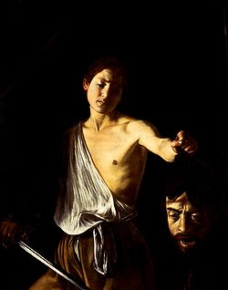 I was looking for inspiration for another blog entry and recalled a seminar session during which the use of light and shadow was discussed.
The artist 'Caravaggio was given as the main subject of discussion', but to be honest, old painters and such artists (as remarkable as they were) are a little too.... traditional for my personal tastes.
 And so, my thought process immediately turned towards a more modern and unusual style of art: Shadow Art.
To the left, and below, are a piece from an artist called Kumi Yamashita, who is well-known for creating artwork by placing unusual objects into a precise order and adding a light-source.
This light-source creates a shadow of the objects used, to in turn create a whole new image.
In terms of visual communication, it's a crazy notion.
To use one visual cue to create an entirely new and original graphic through which expression and discussion can be manifested is quite a remarkable feat.

There are two differing sources of discussion in Yamashita's artwork; the first being the unusual objects used to cast the shadows, and the second being the shadow itself. It is almost as though there are two conflicting images combined onto one canvas, and in a sense, they are fighting for attention: the mind wants to consider how the image has been created (by looking at the objects) but at the same time, the main focus of the image is the shadow (without which, the image would not be impressive enough to warrant such apt attention).
It leads me on to consider how the mind can be tricked with the addition or removal of a light source. For instance, it is stereotypically believed that to best experience a horror film, you should watch it in the dark. This is presumably because the film itself has dark overtones which compliment the viewer's surroundings to heighten the experience. The viewer becomes fully intergrated into the film, because in a sense, they are experiencing similar key elements themselves via the removal of a light source.
A further point brought up in the same seminar was how possible it is to still experience such feelings when in an industry that demands such depth of analysis. By looking so deeply into the image, it is sometimes the case that the 'magic' is lost, and you become so involved with how the image was produced, that you forget to take a step back and simply enjoy it. I, personally, find it quite an exhilarating thought to know I can deduce how something has happened and yet still marvel at the content of the image. In a way, it's almost as though I know something the rest of the world doesn't - even if that is through my own self-evaluation of the image. I can see the image from two different angles - as both a viewer, and also as a producer.
Two points of view through one pair of eyes. Which leads me neatly back to Shadow Art, with their two different images combined onto one canvas to create a whole product. Clever stuff.
Saturday, 19 March 2011
Analysis of 'Independence Day' Trailer
Courtesy of THX1968 at YouTube
Independence Day is a 20th Century Fox broadcast released on July 3rd 1996, starring Will Smith, Bill Pullman and Jeff Goldblum. A science-fiction and action film, it was a turning point for CGI-aided moving pictures and proved to be widely accepted in many countries, becoming a big hit in the United States of America and Great Britain. The trailer broadcasted before its release played a significant part in promoting the film and helping in its world-wide fame.
The film’s primary target audience is fans of science-fiction films of any age between early teens to late forties, proven by its futuristic, alien-inspired plotline and exciting CGI sequences. For people of this vast age group, it would be fairly easy to understand the film and its plotline, while to anyone younger it could be a little difficult to grasp. I also personally believe it is aimed more at males, rather than females, judging by its inclusion of fast-paced action sequences, the alien storyline, and the CGI-created explosions and their related special effects.
The film’s secondary target audience is fans of the actors who star in the film, like Will Smith or Bill Pullman. The fact that such widely acknowledged actors have managed to grab a role in the film encourages their fan-base to watch the film, if only to see them.
CGI plays a big part in the overall acceptance of the film by its audience, but it is incredibly difficult and extremely expensive to make a CGI-aided sequence. Because of this, 20th Century Fox had amazingly high production costs, both due to the CGI but also because of the use of such well-known actors. Famous actors expect a higher wage.
However, due to the fact that 20th Century Fox is such a vast media company, they have managed to gain themselves a reputation of excellence. So just showing their logo and the company’s personal sequence at the start of the trailer helps to promote the film before it even begins; viewers know that, while it is not guaranteed that they will enjoy the film, they can be certain that they’re viewing something of extremely high quality. The purpose of any trailer is to promote the film, to advertise it, which will, hopefully, encourage more people to watch it and pull in more money, which is any film’s ultimate goal. So the fact that viewers straight-off know that the film is of a high standard gives the film an even greater chance of being accepted by the audience.
Another way Independence Day wins over its intended audience is its constant use of enigma. Even the trailer, lasting about a minute and a half, is full of mystery and hails a large number of questions that need answers. The text that helps to push the trailer along uses ellipses, and example being the opening shot of the phrase, ‘On July 2nd …’. This ellipse signifies that there is more to come, so the audience has to continue watching to find out what will happen on July 2nd.
Another enigma is shown through the graphics themselves: showing the people staring up, shocked at the sky makes viewers want to know what has shocked or amazed them. A second example of an enigma within the footage itself is when the opening sequence shows shots of famous American landmarks being overshadowed. Right from the beginning, people want to know what this shadow is, what is making it and why.
While the ‘shadow’ sequence serves to provide mystery, however, it also has a second function. The shadows are representational images imported into the film. The fact that they cover the Manhattan Skyline in one scene serves to represent the threat, which is, as of yet, undiscovered by the audience due to the fact that the trailer has yet to reveal what it is, to America’s economy. This shadow also covers a statue of Abraham Lincoln, who was responsible for the abolition of slavery, signifying the freedom of the American people being quenched, and the fact that it also covers the Statue of Liberty reiterates this point.
There are other points of representation within the trailer, though. The alien threat itself is represented through the spaceship and its shadow, as well as the use of lasers, which are almost always highly associated with aliens and their technology.
War is also represented within the trailer, shown through the CGI explosions and the fighting scenes and also in scenes of destruction and devastation (post-invasion scenes).
The trailer includes various pieces of ideology, ranging from the classic ‘good versus evil’ morale which is featured in many films – in this case, the aliens are evil, symbolised by the dark shadows shrouding the ship and the fact that they are attacking the humans -, to ideologies specific to America (demographics are key, here, as the film is produced and filmed in America, with American actors and an American setting), which can include Democracy signified through the shot of the White House, to the idea that a country should work together, shown through the shots of the American citizens working in unison to bring down the alien threat.
There is also a value with the fact that the shadow covers the Statue of Liberty. It gives the sense that this unknown threat is more important, and much more significant than America, which is highlighted further by the fact that the camera angle has the viewers looking up to the Statue of Liberty, rather than down upon it or straight at it.
As well as this shot, there are various types of Camera shots included within the trailer, ranging from low-angled shots of landscapes or people or action shots, to high-angled shots of locations like the White House. The fact that we are looking down upon the White House signifies diminished power, and that the shadow proves that the threat is supposedly far more powerful than the United States, (which in turn is represented by the White House as it is the seat of ultimate power in America).
Throughout the entire trailer, all camera shots are sharp and completely focussed. Certain scenes are fast-paced and follow action-packed sequences, pulling a lot of shots into a few seconds to get the maximum effect, advertising as much as possible to persuade the audience to come and see the film without spoiling the plot.
One of the best uses of camera, in my opinion, coincides with an impressive piece of CGI, about a minute into the trailer, when a fireball is reflected in a car window. I believe this is a strong demonstration of the skill that the special effects and CGI teams had during the film’s production.
Another piece of Media Language demonstrated within the trailer is its use of colour. There’s a strong use of contrast between darks and bold and bright colours; darks shown through the shadows, to eerie colours that represent the aliens, to bright, colourful explosions. This wide variety of colour serves to keep the audience interested, as it continuously jumps from one to the other, from dark to bright, often coinciding with the content on screen and how characters are deliberately portrayed – classic dark tones for bad guys, and lighter tones for good guys (stereotypical of modern film and TV characterisation).
I personally believe that the trailer for Independence Day is incredibly effective. It promotes the film perfectly, keeping a strong balance between action and mystery, showing just enough to make people want to see it without giving away the whole plot. Which is, in a sense, all you can ask of a film trailer.
Analysis of the Cadbury Gorilla Advert
courtesy of macegrove at YouTube.
This is, quite possibly, one of my favourite adverts of all time, just because it is so unusual. At first glance, there is very little in the way of content to associate the ad with the product being advertised. I see no bars of chocolate in sight until the outro. Only people who recognise the subtle hints as to who the producers are prior to the end of the ad would have any idea that this is, in fact, a tremendously massive company.
The purple colouring refers to the packaging. The 'Glass and a Half Full Productions' slogan was created and plugged as being the official slogan for the company's forthcoming series of chocolate adverts (including this one). The silver of the drumkit symbolises the inside wrapping of the packaging. But... I see no actual chocolate bars to demonstrate they are, in fact, still a chocolate production company. For all the advert suggests, they could be promoting Phil Collins, a Drum-kit company, a famous Gorilla... who knows?
But that is the point. The advert is lacking anchorage until the outro kicks in. This is a deliberate marketing technique. It's so unusual, it will stick in your head. Viewers remember the ad, will remember who made it because it is so bizarre, and are subsequently more likely to purchase a product because the advert made them smile.
The gorilla is a signifier for happiness. The happiness that customers will experience if they purchase this particular brand of chocolate. I can deduce this from the happiness and freedom expressed by the gorilla when he begins his drum-solo. It is almost as though the majority of the ad is in place to build up to this one moment. The suspense. Which, in turn, could signify the suspense consumers will experience as they're waiting to take that first bite.
In conclusion, I believe that the advert for Cadbury’s Dairy Milk, while being controversial due to a possible lack of understanding for some people, is a great example of advertising. It grabs viewers’ attention, mixes audience’s likes of music and chocolate with an unusual main character and, above all, advertises the product enough to increase profit, which is, essentially, any business’s underlying goal.
Wednesday, 16 March 2011
Graphics Tablet Suzuki Bike - Flash Drawing
 So. I started with this....
A photo of the 'Rio Grande' road in Western Texas (apparently one of the most scenic roads in the world!).
With a little photomanip and a whole lotta love, I ended up with a scene that would better suit the 'Flash drawing' design of my own artwork (you will see later!) to use as a backdrop. Gladly, I would have taken this photo in person to use for this particular piece of artwork, but alas, flying to Texas just to take a photograph would have been a bit too great a stretch for a student budget.

Next, now that I had a lovely comic-style background (and I've just realised a lovely 3 on 3 pattern happening with regards to the 'Rule of Thirds' but more on that in a second), I used a Graphics Tablet to draw a Suzuki Bike in Adobe Flash CS3 (see below).

Aannnnddd, finally! The moment of truth...
Combine Flash-drawn bike with Comical background....
 And happy days.
The bike actually fits in with the image. See, as I was drawing it freestyle in Adobe Flash, the background was plain and boring and grey. Which was great while I was drawing, but as a finished image, it lacked a little... shall we say, pizazz? When I combined the flash-style super-bike with the original Rio Grande photograph, it looked dramatically out of place. As an image, if I were going for making a statement, it could have worked, I suppose. 'Expressive meets Tradition', and all that. But at the end of the day, due to my fascination with comic-books and the wonderfully simple and bold style of drawing in Flash, it just made sense to combine the two elements together for the finished piece.
Rule of Thirds - twice! One second...
 Okay, so it's not exactly perfect, but considering it's a manipulated photograph, it's pretty damn close. Almost as though Mother Nature herself understood the concept of the Rule of Thirds when creating the landscape (or insert religious idol of choice, if it isn't Mother Nature according to your beliefs).
Upper section = sky.
Middle section = mountain range.
Lower sections = road, bike, ground.
Each section draws the viewer's attention to a certain aspect of the image. It's quite amazing that the correct positioning of a camera can create an image with clear proportion, enough to purposefully segregate elements of that image according to this rule.
(As a footnote, yes, I am British. And my superbike wants to drive through Western Texas into oncoming traffic for the laughs, just because we do that at home. Seriously, are we the only people to have 'left-hand-traffic' laws? Call the bike's positioning a culturally-inclined alteration to the norm of drive-time in southern America. Just because I'm British.)
Tuesday, 15 March 2011
Roland Barthes - Relay
Reference to:
Barthes, R. (1977) "Rhetoric of the Image." Image, Music, Text. Ed. and trans. Stephen Heath. New York: Hill and Wang. 32-51.
"The function of relay is less common (at least as far as the fixed image is concerned); it can be seen particularly in cartoons and comic strips. Here text (most often a snatch of dialogue) and image stand in a complimentary relationship."Barthes, R. (1977) "Rhetoric of the Image." Image, Music, Text. Ed. and trans. Stephen Heath. New York: Hill and Wang. 32-51.
As a follow-up, here's the other side of the 'language and image' marriage:
 Take the image on the left as an example (I'm sorry, but it made me LOL so hard. Had to include it).
It is pretty obvious in the image what is happening, though without direction, some unusual persons could probably mis-read the image minus a caption (aka chavs).
To dumb it down for said unusual individuals, a 'macro' - or caption, in posh terms - has been added to compliment the image (or to demonstrate in lay-mans terms just exactly what is happening in the image).
For hilarity, rather than using 'proper English' to describe the content, text speak (or game speak) has been included. This makes the image immediately attractive to gamers, youngsters, geeks, (even chavs!), etc. I suppose it would probably not count as a relay example to those who do not understand the meaning behind the word represented (bless, it would probably just serve to confuse them). However, for those who do understand that 'powned' is a gamer term for being beaten quite violently by an opponent, the language directly compliments the image, thus relaying meaning between text and picture.
Before you ask, no I'm not going to include this in my essay... but it made me chuckle.
I doubt Barthes could ever have predicted his theories would one day be used to describe a Macro image...
Subscribe to:
Posts (Atom)