Wednesday, 16 March 2011

Graphics Tablet Suzuki Bike - Flash Drawing

So. I started with this....

A photo of the 'Rio Grande' road in Western Texas (apparently one of the most scenic roads in the world!).

With a little photomanip and a whole lotta love, I ended up with a scene that would better suit the 'Flash drawing' design of my own artwork (you will see later!) to use as a backdrop. Gladly, I would have taken this photo in person to use for this particular piece of artwork, but alas, flying to Texas just to take a photograph would have been a bit too great a stretch for a student budget.

Next, now that I had a lovely comic-style background (and I've just realised a lovely 3 on 3 pattern happening with regards to the 'Rule of Thirds' but more on that in a second), I used a Graphics Tablet to draw a Suzuki Bike in Adobe Flash CS3 (see below).


Aannnnddd, finally! The moment of truth...


Combine Flash-drawn bike with Comical background....


And happy days.

The bike actually
fits in with the image. See, as I was drawing it freestyle in Adobe Flash, the background was plain and boring and grey. Which was great while I was drawing, but as a finished image, it lacked a little... shall we say, pizazz? When I combined the flash-style super-bike with the original Rio Grande photograph, it looked dramatically out of place. As an image, if I were going for making a statement, it could have worked, I suppose. 'Expressive meets Tradition', and all that. But at the end of the day, due to my fascination with comic-books and the wonderfully simple and bold style of drawing in Flash, it just made sense to combine the two elements together for the finished piece.

Rule of Thirds - twice! One second...

Okay, so it's not
exactly perfect, but considering it's a manipulated photograph, it's pretty damn close. Almost as though Mother Nature herself understood the concept of the Rule of Thirds when creating the landscape (or insert religious idol of choice, if it isn't Mother Nature according to your beliefs).

Upper section = sky.
Middle section = mountain range.
Lower sections = road, bike, ground.

Each section draws the viewer's attention to a certain aspect of the image. It's quite amazing that the correct positioning of a camera can create an image with clear proportion, enough to purposefully segregate elements of that image according to this rule.

(As a footnote, yes, I
am British. And my superbike wants to drive through Western Texas into oncoming traffic for the laughs, just because we do that at home. Seriously, are we the only people to have 'left-hand-traffic' laws? Call the bike's positioning a culturally-inclined alteration to the norm of drive-time in southern America. Just because I'm British.)

Tuesday, 15 March 2011

Roland Barthes - Relay

Reference to:

Barthes, R. (1977) "Rhetoric of the Image." Image, Music, Text. Ed. and trans. Stephen Heath. New York: Hill and Wang. 32-51.

As a follow-up, here's the other side of the 'language and image' marriage:

"The function of relay is less common (at least as far as the fixed image is concerned); it can be seen particularly in cartoons and comic strips. Here text (most often a snatch of dialogue) and image stand in a complimentary relationship."

Take the image on the left as an example (I'm sorry, but it made me LOL so hard. Had to include it).

It is pretty obvious in the image what is happening, though without direction, some unusual persons could probably mis-read the image minus a caption (aka chavs).

To dumb it down for said unusual individuals, a 'macro' - or caption, in posh terms - has been added to compliment the image (or to demonstrate in lay-mans terms just exactly what is happening in the image).

For hilarity, rather than using 'proper English' to describe the content, text speak (or game speak) has been included. This makes the image immediately attractive to gamers, youngsters, geeks, (even chavs!), etc. I suppose it would probably not count as a relay example to those who do not understand the meaning behind the word represented (bless, it would probably just serve to confuse them). However, for those who do understand that 'powned' is a gamer term for being beaten quite violently by an opponent, the language directly compliments the image, thus relaying meaning between text and picture.

Before you ask, no I'm not going to include this in my essay... but it made me chuckle.

I doubt Barthes could ever have predicted his theories would one day be used to describe a Macro image...

Roland Barthes - Anchorage

Reference to:

Barthes, R. (1977) "Rhetoric of the Image." Image, Music, Text. Ed. and trans. Stephen Heath. New York: Hill and Wang. 32-51.

The concept of an image having endless interpretations without an attached caption to ground the viewer's rogue imaginations fascinates me.

Barthes believed, "... all images are polysemous; they imply, underlying their signifiers, a 'floating chain' of signifieds, the reader able to choose some and ignore others."

In a sense, he describes an image's ability to give off a great (sometimes limitless) amount of different interpretations, depending on social, ethical and stereotypical inclinations of the viewer in question, who can then choose for themselves what they believe to be the truest interpretation. What is depicted for one type of person will differ completely from what another person sees in the image; due to reasons like social status, personal upbringing, cultural reference and individual opinion. Without a caption to ground the image and describe / explain EXACTLY what is depicted, there is no way of saying for certain what the true purpose / description of the image really is.

Anchorage does this - adds a description or a caption to an image, giving the reader absolutely no doubt as to what the content actually displays. This way, the media artist can get across a specific meaning, one that will be virtually universally recognised for what it is. Without this 'anchor', the possibilities are endless.

People will believe what they want to believe until it is proven otherwise.

Take the image on the right as an example.

I could tell you that it's actually an image of my great uncle. And unless you'd seen the image before, there's absolutely no way to disprove my interpretation. (The fact that I did have a great uncle who looked rather like him is irrelevant).

Similarly, I could admit to you that it's actually a sketch-drawing of Roland Barthes, himself (if Wikipedia is to be believed...). But there's nothing to say I'm telling the truth (even though I am). Thus, demonstrating that Barthes' thesis does actually make sense: without an anchor, viewers are free to interpret the image in any way they choose.

Like I said. Fascinating.

Friday, 4 March 2011

Owl City - Fireflies Single Cover - Analysis

While my previous post demonstrated how the colour 'blue' can represent sadness, my next image shows the colour in a much more positive light. The purpose of doing this is to demonstrate that not all colours are symbolic of a single meaning. Colours can represent a number of different emotions depending on the content and context of the image, and indeed the cultures of those who are viewing that image at any particular time.


I am uncertain if my prior knowledge of the band has swayed my feelings towards this image, or not. For people who have not heard their musical style - for those who do not know how... refreshing and uplifting their music really is - it may provoke a slightly different reaction.

But, whenever I see this single-cover, I smile.
Perhaps it isn't the same for everyone. As with most artistic endeavours, personal opinion is key; if somebody doesn't like something, they don't like it. Simple. In this case, people who are not interested in cityscapes, or who do not find them appealing to look at, would probably feel differently about the image. Similarly, those who do not like the band may not like the image for that reason, because it represents something they have little interest in.

But for me, personally, I think it is a beautiful image.

I absolutely love the cityscape backdrop. The rule-of-thirds has been executed artistically - with the band name and song title in the bottom third, the cityscape in the middle third and the 'spacey' skyline in the upper third. Though, in this case, the thirds are not all identical in size - the bottom one being much larger than the top, rather than equally spacing all 3 sections.


The blue overtone makes the image sparkle, almost. It definitely has a futuristic feel, I believe. The skyscrapers and buildings are symbolic of man's desires to reach for the stars - to one day be out there amongst them, reaching up like infant hands groping for their mothers, their protectors, the angels (or 'stars', as depicted in the upper third, which could in turn represent the fireflies referenced in the song, itself) watching over them from above. I'm unsure of the image's true intentions (aside from promoting the single, of course - profit is everything in business), but I see man-made glass and steel creations reaching out to the stratosphere: I see Man's unquenchable thirst to reach out and become a part of the Universe. And it makes me smile.

The 'out-of-this-world' feeling I depict from the image can in turn represent a significant part of the style which makes up the music created. A lot of Owl City's songs seem science-fiction-inspired, with soft, twinkling melodies and whooshy, gliding undertones. When I see this image, I think of a modern-to-futuristic style of music. They certainly deliver, in that respect: see fan-made music video, below...


-- The video was created by (as seen on YouTube) and the lyrics and song belong to Owl City. The Doctor Who clips belong to the BBC (Stephen Moffat, etc). No copyright infringement intended and no money is being made, here. Use of video and content is purely for educational purpose. --

Tuesday, 15 February 2011

Sherlock Wallpaper - Analysis

Here is a wallpaper I created using Serif PhotoPlus X3, with the purpose of promoting the BBC television show "Sherlock" to friends in online forums. The wallpaper was created at the request of an associate who was eager to see a wallpaper that featured the two main characters only - and their only aesthetic request was that I also incorporate the colour 'blue' as heavily as possible (as it was the client's favourite colour).


Taking into consideration this restriction, I have heavily influenced the mood of the image by using filters and specific blue-toned shades. Blue generally gives the impression of coldness - possibly from the association of water / ice / sky being cold and blue - and also sadness. Therefore, by using blue as the predominant colour for the image, I was aiming to get across the idea that the protagonist (Sherlock Holmes) is, in fact, a rather cold, sad, almost lonely character. The character of Sherlock Holmes, in all representations - books, films and now this television series - has always been seen as a solitary figure: that is to say, it's almost as if he is the only man alive who has such an extraordinary talent. And as is hinted at commonly across the realms of heroes / super-heroes, being a paragon protagonist even with friends / family providing support is incredibly difficult to face without feeling like an outcast from society. Characters like Superman / Batman / the Doctor (Doctor Who) and Merlin (from the BBC show of the same name) are all incredibly powerful and incredibly unusual, and more often than not are forced to hide their true identities for fear of persecution or betrayal. Each character hides a great deal of themselves from the majority of the world, thus demonstrating just how easy it is possible to become cold and lonely when in a position of great importance. This is also true for Sherlock.

As the original character created by Sir Arthur Conan Doyle existed in a much older time-period, I decided to immitate the intentions of the show's producer, Steven Moffat - who wanted to place the same old-style characters into a modern-day setting - by combining new and old elements together within the image. The outfits both characters are wearing are modern - leather jackets / long trench coats and a stylish scarf and hairstyle. These represent the modern day setting of the show. The old-style streetlamp, clockface and brass door knocker for 221B Baker Street, however, are more authentic-looking and were included to represent the original era of the characters. This was my way of achieving the same old/new combination as the show's creator intended.

By splitting the image in two - using the 'wall' of the image on the right one side which seems to cut through the centre of the image - I have managed to draw the viewer's focus to the protagonist almost straight away. This is because he is shown having a much bolder, darker tone and is also much more heavily detailed, as well as being positioned in the foreground of the image. By adding in filters to harden the edges of the 'Sherlock' on the right, it demonstrates that he is the main character of the story. So for people who have never seen the show, it should be easy to spot who is the protagonist. By including the title of the show - and the character's name - I am also able to reinforce the importance of this character. The final trick to show that this is the first part of the image I wanted viewers to see, I added a strongly contrasting colour to this side of the image - the Yellow of the streetlamp. Due to its intense contrast with the blue of the rest of the image, the eye is easily drawn across to it, and thus their attention will then be drawn to the main character, who is positioned directly below the item of contrast.

Thursday, 20 May 2010

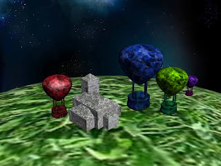
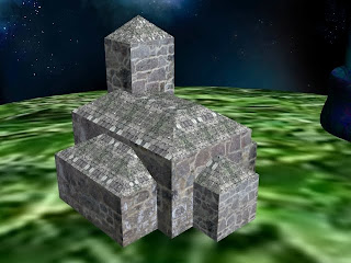
Hot Air Balloons and Church Model

To better practice my UVW Wrapping skills, I created simple shapes which need better wrapping techniques to make them look more lifelike. I chose an angular building (church), which is made up of many different parts all attached together after working with the textures.


I used two hand-created textures for the church - one which represents old brick and one which represents old slate tiles for the roof sections. I used the UVW Unwrapping process to ensure the roof was a different texture to the brickwork, in the hopes of making it look more realistic. The hot air balloons also depict my own hand-made textures, but they deliberately look a little more wild and colourful, rather than going for attention to detail as I did with the church.


I have found that it is incredibly fiddly and time-consuming, but the end results are quite positive. The Grassy background is simply just to make it look like it is actually standing on something, so I'm not too fussed that it doesn't look quite as realistic. Maybe if I were to include this as part of a portfolio, I would work a little more on making the grass look more like grass, rather than greenish blurs. But as my main focus for this post is the building itself, I don't mind too much at the moment. It's something I will work on at a later date.

UVW Unwrapping

This is a screenshot of the UVW Unwrap process I have started. I plan to incorporate a new texture, combining a more metalic looking texture with a more organic looking texture. This is to help make it more obvious that it is actually a built space-ship.

To do this, I created the two separate Textures using Adobe Photoshop and combined them using an Overlay alteration so as to see both at the same time and be able to work with them together.


I then had to go into 3D Max and add a UVW Unwrap Modifier. Next, I went into the 'Edit' and used the 'Flatten Mapping' tool to smooth out and separate the individual pieces of my model. I then used Print Screen to copy this model structure over into Photoshop to work with it.

Finally, it was simply a matter of altering the different sections with my two textures (Shown in the screenshot below after taking out the UVW Breakdown), before saving it as a total texture and using the 'Materials' tool in 3D Max to wrap it around my model.

The image at the top shows the above texture wrapped around the small part of my model. After creating this one, I shall use the same process to create similar textures to wrap around the other sections.