Thursday, 10 December 2009
3D Max Plane
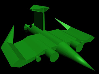
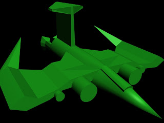
To create this 3D model of a plane, I created a cylinder, turned it into an Editable Mesh, and used a collection of different alteration methods to extrude, move, resize and weld different sections into the rough shape of a spacecraft.
To make the craft identical on both sides, I created one side of the craft, and then used the 'clone' method to copy it. Finally, I hit the 'Mirror' button to create the finished product and attached and welded the sections together to make one final model. For the image below, I took the same file as above, altered the wings slightly to reduce the width of them and also used an extrude and 'Bevel' tool to create a small area at the front for the cockpit.
Thursday, 5 November 2009
Creating a 3D Toy in Max
This is a simple 3D toy which I have created using 3D Studio Max. To create it, I have used skills such as Bevel, Extrude, Weld and Attach. I have created a number of different shapes - including squares, cylinders, cones and circles, and then extruded parts to extend them, welded parts together to tidy everything up, and attached each of the shapes together to make it complete. In this Render, it doesn't look quite as good as my model, as there is a cone which goes between the head and the body - it doesn't show up in the render, though.
I got the idea to create this, as I used to play with 'wind-up' toys a lot when I was little: an example of which is found in this next image. I found them very entertaining.
With this 3D Model, I wanted to create a wind-up toy which would move (thanks to the wheel at the front). However, this would take a great deal more work before it is complete and 'useable'. As it is, the wheel wouldn't move, for instance, because the body resting on it is too 'square'. It would just drag along the floor if it worked at all. To make it more realistic, I would have to remove any part that could impede on movement, and would also probably need a second wheel at the back to help support the model. Also, I would want to make the 'wind' look more like the ones I used to use, rather than having it a simple square.
Considering this has taken me a few hours and it is still very basic, I would imagine it could take days or possibly even weeks to come up with a finished, final, professional model for a toy of this style.
If I have more time on this, I would like to round off the model and make it a little bit more realistic in terms of usability - remove the barriers stopping it from potentially moving and just tidy the whole model up.
Monday, 2 November 2009
3D Modelling - The Pumpkin
Using a tutorial to refine the more complex parts of this model, I have managed to create a Halloween Pumpkin using 3D Studio Max. I am very happy with how it has turned out, and considering I have only been playing with Max for a couple of weeks, feel very proud of this achievement.
With a little support from my Tutor, Chris, I managed to add in some suttle lighting effects, with the intention of making it look that little bit more 'creepy'. I feel it has worked.
The only negative is it is a little dark against the black background, but when I tried to amend this, it lost the 'spooky' feel I was going for as it was too illuminated.
But other than this, I am really happy with this model. Not only was it successful, but it was also fun to make, as well.
Thursday, 8 October 2009
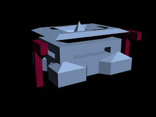
Unit 64 - Box Modelling in 3DS Max - House
To create this house, I first created a simple box shape and turned it into an Editable Mesh. I also had to enable the edged faces, to 'segregate' the many individual sections. This allowed me to Extrude and Bevel specific squares to create different shapes (such as the pointed roof shape and the side extensions).
I have discovered that by adding multiple shapes and boxes, larger, more complex creations can be made. A box is turned into a specific object which links to the image as a whole (my example being two simple-looking street lamps being created using individual boxes but adding to the whole piece).
Thursday, 24 September 2009
Animated Logo in 3D Max
This is an ident of my nickname created using 3D Max. I have used Splines and Extrudes to create a Spring with my name on, and then used the 'Bend' option and altered the positions of the Bend at specific points on the TimeLine to record it. The Sphere in the centre was created by using a simple Lattice option, and as with the 'Bend', this has been altered at specific points along the time line to give the impression it is pulsating.
Labels:
3D Max Animation Mogwai Nickname
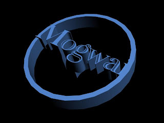
Name Logo in 3D Studio Max
This is a Render of a logo I have made using 3D Studio Max. To create this, I have used simple 'Spline' tools to create a doughnut shape, a helix shape and a text shape, and then used an 'Extrude' option to make them look 3D.
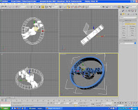
To the right is a screenshot of the 3D Max interface, displaying different views of this logo.
Monday, 22 June 2009
'Late Again ...' Stop-Motion Animation
For my Unit 32 project, I had to research, plan, create and evaluate a Stop-Motion Animation. I worked with Jade Hodgson to plan and create a cut-out animation, and then personally edited the footage at the end to personalise it. We could have used any form of Stop-Motion Animation - Cut-out, Claymation or Pixilation - but we chose Cut-Out thinking it would be more interesting and potentially easier than the other options.
How wrong we were!
But anyway, here's what we came up with in the end. The footage was taken together - with us both filming and moving the characters. I have personally added in the border, the sound effects and the lighting alterations. We were trying to work to standards assimilating South Park and other professional cut-out animations - we tried to reflect this by using strong, block colours and simply designed characters. This, I am happy with. However, I'm not overly happy with the frame rate. Due to technical glitches (like cameras running out of battery and an absence of any form of artificial lighting!) the finished animation isn't as smooth and 'professional' as I was really aiming for. But hey ho. At least it's all done now!
Labels:
Bus,
Cut-Out,
Late Again,
Stop Motion Animation,
Unit 32
Friday, 19 June 2009
Unit 33 - E4 Ident Project (2D Animation)
This is the finished Flash Animation (including sound) for my Unit 33 project. The project involved researching E4 Idents (as well as other channels with Idents) with the intentions of then creating my own Ident for the channel.
I created it using Adobe Flash CS3, ActionScript 2, and hand-drew each frame myself. The story is simple - two characters look outside (through window and door) to see flowers sprouting in their garden. All is well until one evil-looking flower starts to grow, which then proceeds to attack the character at the door. He escapes inside, and the plant splats against the door creating the E4 logo, before zooming to fill the screen ready to fade out at the end. I did have to edit the story slightly from what I had originally intended to do - the plant was supposed to grow vines and these would form the E4 logo, rather than the plant itself. However, I found this too tricky to achieve, and also felt the logo should realistically be purple in colour, rather than green, because the actual E4 logo is purple. So I decided to alter it to have the purple plant splat against the door, as this was easier to create but it also meant the logo would be the correct colour.
I have included two forms of audio with this clip - one being a 'splat' sound effect which I have carefully placed to ensure it fits with the impact of the plant in the video, and the other being a music file I have personally edited to include. The original track was 'Zambezi' created by 'The Piranhas', so it isn't my own file, but I have edited it before using it. I took the opening few seconds of the clip, altered it by slowing it down and expanding it, and then uploaded the sound file into Adobe Flash to include it as the backing track for the advert.
Overall, I am quite happy with my finished video. I have managed to stick to the deadlines with regards to production and upload, and believe it is of an accurate length for an Ident. My only criticism is that some sections aren't quite as fluent and smooth as I had been hoping for. But this comes down to a rush with regards to finishing it on time. Therefore, were I to work on this again, I would like to go back and smooth down the whole animation, adding in extra frames to make it look that little bit more professional and impressive. But other than that, it has turned out pretty close to how I hoped it would.
Unit 53 - Storyboard Project
This project involved researching and finally creating a storyboard, with an included character from a team-building exercise we took part in at the start of the year (this project being a 'Name the 100 Cartoons' quiz). The character I chose to work with was 'Kimba the White Lion', a cartoon character from an old anime. I had intended originally to work with a more 'scratchy' style of artwork - as I attempted to do on the image I made displayed above. This would have made for a more unique and original storyboard. However, time constraints meant I had to work as quickly as I could without worrying about altering the style of my artwork - it was more a case of simply getting it finished, rather than getting the style right. If I were to have more time to work on my storyboard, then I could have altered the style to fit with the 'scratchy' style I wanted, but as it is, time has run out. :/ Therefore, the end product doesn't completely match my original intentions - by the fact it isn't the style I was hoping for. But aside from the actual artistic style, everything else has worked out how I had hoped it would.
On the left is my finished hand-drawn version of the storyboard I ended with, which I have scanned in ready to recreate the digital version. It is a simple story; at an electronics store (near you) the show, 'Kimba the White Lion' is being shown on a flat-screen television. Kimba sees the TV, however. And jumps out. There's a girl in the store who is scared by this, but then Kimba gets scared at seeing the girl who is - once the shock wears off - incredibly excited. She chases Kimba through the store, but he escapes outside and runs off down the street. It has no violence or foul language, therefore it is suitable for a younger audience to view, and as Comic Strips are mostly targeted at young audiences, I have successfully created a storyboard to fit with my target audience.
On the right is my final digitally amended version of the storyboard. I have created this using PhotoShop CS3, after scanning in the original version to use as reference to redraw each box on a separate layer. I have added in text and a title - 'Kimba Encounters the Humans' and created a textured background to help bring the whole piece together using pre-installed brushes. I used a collection of 'Fractal' brushes for the background, and have used other techniques such as including gradients, paint and using the pen tool to get strong black outlines. My boxes are abstract and unusual, rather than simple square boxes. This is because I have tried to incorporate some of the different layout styles I researched to make my storyboard look more interesting. I had originally planned to use different fonts, as well. I researched into different styles but found when it came to putting them on my final storyboard, they weren't very easy to read. Therefore, I have stuck to a Comic-strip Classic - Comic Sans and am pleased with how it looks on my finished Storyboard.
I have successfully managed to meet the deadline of this project, although it has resulted in me altering the style of my storyboard from the one I wanted to a more simple, cartoonish style. This is the only problem I have encountered with regards to timing. I have learnt a variety of new skills on PhotoShop - prior to this, I had never been able to successfully use the Pen tool to create strong lines, and had simply struggled with the brush tool to make them as thick and straight as possible. This new skill will definitely be useful to me in the future.
Overall, I am very happy with my finished Storyboard, albeit without the artistic style I had intended. The only thing I would change is the style, and if I were to progress further and create the actual Comic Strip, it would have been good to make it Interactive, as well.
Labels:
Cartoons,
Comic Strip,
Digital,
Kimba,
Storyboard,
Unit 53
Friday, 12 June 2009
Unit 18 - Icons Project
For this project, I was asked to create 5 different Icons to replace five icons on the Apple iPhone. Each icon had to fit in with a specific genre, those genres being; Comedy, Horror, War, Fantasy and Sci-Fi.
The image on the right shows my finished icons actually in place on the iPhone.
I created them in PhotoShop using a graphics tablet. I saved them as .gif files suitable for web display, and made the backgrounds transparent so that only the icons would show up when placed on the iPhone.
I have tried - when designing - to make the colour schemes of each icon match the genre, and made sure to use images that can be immediately recognised for their genres. I believe I have managed to keep to my original intentions with regards to the designs of my five icons. They are the same in size, shape, colour and image as my initial drawings, which I am happy about. They have turned out pretty much how I expected them to and hoped they would. :)
Subscribe to:
Posts (Atom)